The dining room has always been more than just a space for meals. It’s a setting for gathering, connection, and conversation. It’s where birthdays are celebrated, holiday dinners are shared, and casual weekday meals can become truly special.
Such an important room in your home deserves a color palette that sets the mood, speaks to your style, and leaves a lasting impression on every guest who walks through your door.
Unlike more utilitarian spaces like the kitchen or bathroom, your dining room is often free from cabinetry, tile, or major fixtures. That means paint plays an even bigger role, and the right color can completely transform the space.
Below are some of the most refined, stylish, and conversation-starting dining room color ideas to inspire your next paint update.

Warm Neutrals That Welcome and Elevate
Warm neutrals are a timeless choice. Think creamy ivories, soft taupes, and gentle beige tones with just a hint of warmth. These shades offer a clean, classic canvas for your furniture and decor to shine, while still bringing subtle sophistication to the space.
Buttermilk Cream: This light beige with soft yellow undertones creates a sunny, welcoming atmosphere, ideal for morning brunches or afternoon tea.
Almond: A natural off-white that pairs effortlessly with wicker-backed chairs and warm wood finishes.
Sandy Taupe: The perfect middle ground between beige and brown, this shade adds dimension without taking over the room.
Ivory Blush: A white that leans warm with just a hint of rose. It’s romantic, cozy, and surprisingly versatile.
Moody Hues for Intimate Dining
For those who love to entertain by candlelight, darker hues set the perfect tone. Deep, rich colors, such as charcoal-inspired grays, chocolate browns, or even muted navy, instantly make a dining room feel more dramatic, grounded, and intimate.
Charcoal: This deep slate gray adds a polished, modern look that contrasts beautifully with warm metals or crisp white trim.
Brown: A rich cocoa hue that wraps the room in warmth, perfect for evening meals and holiday gatherings.
Dark Blue: Evocative of navy, this cool, moody tone works well in both traditional and contemporary settings.
Midnight Green: For a dramatic twist on green, this almost-black shade with subtle green undertones offers boldness and depth.

Earthy Reds and Tans That Give Warmth
Rustic dining rooms thrive with a palette that’s grounded in nature. Earthy reds, baked clay tones, and soft tan shades can bring warmth and character to your walls while creating a down-to-earth, inviting feel. These are especially well-suited to homes with farmhouse, Southwestern, or traditional architectural influences.
Terracotta: A warm, clay-inspired hue that pairs effortlessly with stone, leather, or natural wood.
Burnt Orange: Rich and earthy, this shade adds vibrancy without overpowering the room.
Rich Tan: A sun-kissed neutral that works well with greenery and woven textures for a relaxed, organic feel.
Warm Gold: A bold, golden-red tone that makes a statement while still feeling grounded and elegant.
Cool and Contemporary: Soft Grays and Tinted Whites
Prefer something more modern? Cool-toned grays and soft, tinted whites can create a fresh, minimalist vibe without feeling cold or uninviting. These hues are especially effective in homes with more contemporary architecture, or for those who favor streamlined furniture and clean lines.
Fog Gray: A light gray with bluish undertones, ideal for pairing with interesting lighting and glass accents.
Soft Silver: Crisp and modern, this pale tone keeps things light while still offering more personality than plain white.
Pearl: A white with a drop of cool lavender that softens the space while giving it a dreamy glow.
Slate: Muted but elegant, this gray with just a touch of green feels fresh, subtle, and highly versatile.

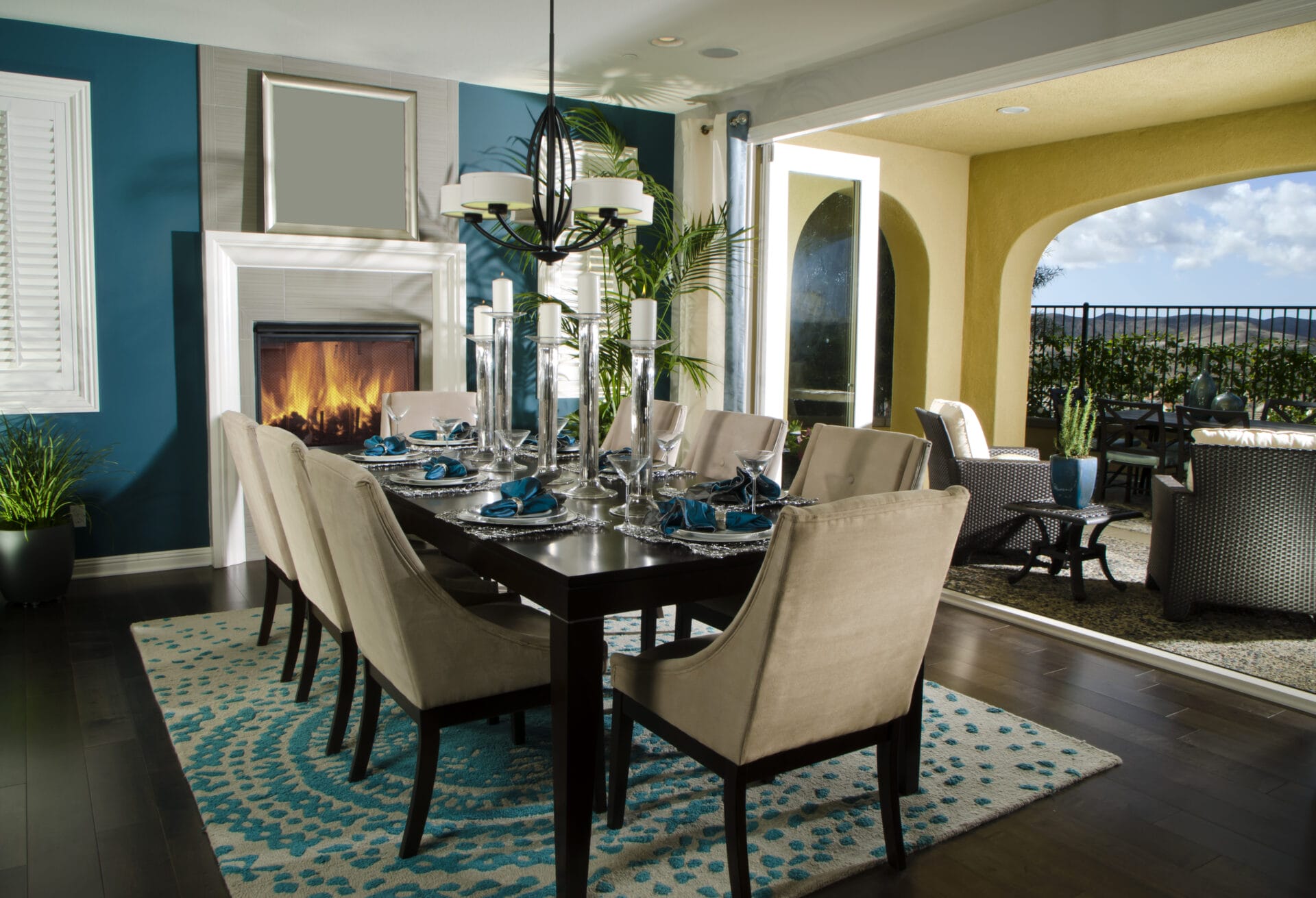
Jewel Tones for Bold Sophistication
If your goal is to impress your guests and turn your dining room into a real showstopper, jewel tones always deliver. Think rich, saturated shades like deep teal, emerald green, or even a warm plum-inspired purple. These are full of personality but also carry a level of timeless glamour that feels right at home in a formal dining setting.
Sapphire Blue: Lush and refined, this jewel-toned blue adds depth and contrast without overwhelming the room.
Emerald: A dramatic green that pairs perfectly with gold-framed art and wood accents.
Plum: A deep burgundy-purple that works especially well with candlelight and brass decor.
Teal: Somewhere between blue and green, this shade feels luxurious and grounded at the same time.
Whites That Aren’t Boring
It’s easy to overlook white when thinking about sophisticated color choices, but a nuanced white can bring stunning results in a dining room, especially when layered with the right textures and accents. Instead of a stark, cold white, opt for a shade that leans warm or tinted.
Porcelain: A true soft white with a delicate warmth, great for reflecting natural light and enhancing architectural details.
Linen: This ivory-leaning shade works beautifully with darker floors and furniture with a pop of color.
Blush: A white with a gentle pink undertone that flatters skin tones and softens the mood of the room.

Statement Ceilings and Accent Walls
If you want to experiment with color but aren’t ready to commit to four bold walls, consider a feature wall or a painted ceiling. Dining rooms are one of the best places to take this creative approach, especially if the space is more formal or separate from other living areas.
Navy Ceiling: Painted ceilings in darker tones create a dramatic effect, especially when paired with chandeliers or warm-toned walls.
Clay Red Accent: A bold yet earthy feature wall adds warmth and structure.
Crisp White Contrast: Try surrounding neutral walls with a sharp white accent to bring in visual clarity and make other room details pop.

Creating Flow from Room to Room
As with any paint decision, the best dining room colors don’t exist in isolation. Consider how your chosen color connects to the rest of your home. Establishing visual harmony between spaces is essential, especially in open layouts or homes where the dining room sits adjacent to the kitchen or living room.
Some tips include:
- Use complementary undertones to tie adjacent rooms together, like warm with warm, cool with cool.
- Echo colors from your dining room in smaller ways throughout the home, like art, textiles, or furniture finishes.
- Neutrals like soft grays or whites with color undertones make great transitions between bolder colors in nearby rooms.
Ready to Redefine Your Dining Room?
A color change might seem like a small update, but in a space as emotionally resonant as the dining room, it can be truly transformative. Whether you gravitate toward timelessness, bold drama, or somewhere in between, the right color can set the tone for the special moments ahead.
Need help bringing it all together? At Legacy Painting, we offer professional color consultations and expert painting services that ensure your dining room turns out exactly as you envisioned. From prep to finish, we handle every detail with care, quality, and precision.
Let’s create a dining space worth gathering in.